Latest Update:
Startup estate agencies: understanding compliance
This is the first in our Back to Basics series, where we step away from the focus on new tools and return to the fundamentals that still underpin a high performing estate agency website.
There’s a lot of discussion around AI, automation and more advanced digital journeys. Much of it is hugely exciting, but in the rush to embrace what’s new, it’s easy to overlook what has always mattered, and still drives performance.
When someone lands on your website, they’re not thinking about your technology, they’re making a quick judgement. Are you credible, do you know the area, and can I contact you easily?
Before refining anything else, ask a simple question. Is it completely obvious how to get in touch? If not, everything else is working harder than it should.
On desktop, users instinctively look to the top right for a phone number. For single branch agencies, keep it clear and visible, and for multi branch firms, make the route to the right office immediately obvious. The moment someone hesitates, even briefly, you’ve introduced friction, and friction reduces enquiries.
On mobile, expectations are higher, so numbers should be tap to call and visible quickly. If users have to scroll or search, the design is prioritising aesthetics over usability.
Many visitors scroll straight to the footer as part of a quick credibility check. They’re looking for confirmation that your business is real and easy to contact.
Your footer should mirror your header. Same phone numbers, same details, no inconsistencies. Small mismatches create doubt, even if users can’t quite explain why.
Just as importantly, show where you’re based. Estate agency is still rooted in geography, and people want to know you’re genuinely part of the area. Don’t hide your address, make it visible within the flow of your homepage. An embedded map strengthens this further, as it provides instant, visual confirmation of your location and reinforces legitimacy in a way text alone can’t.
Not all traffic lands on your homepage. Property and branch pages often attract users who are further along in their decision making.
If someone decides to call while viewing a property, that option needs to be immediate, so keep contact details visible without much scrolling, especially on mobile.
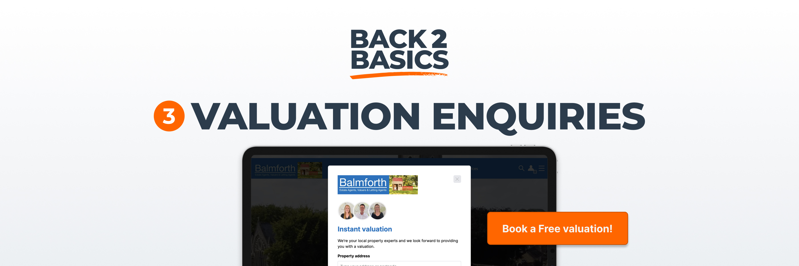
Displaying an email address might feel transparent, but it creates a fragmented experience. Users leave your site, and enquiries arrive unstructured and difficult to track. That means losing visibility over where leads came from and how they engaged with you, at the exact moment they convert.
A well designed form keeps everything in one place. It captures structured information, feeds into your CRM or lead management software, and supports consistent, measurable follow up, while keeping users within your website environment.
Practical details still carry weight. Visitors often check opening hours before calling and look for confirmation that your office exists where you say it does.
Clear opening times and an embedded map remove uncertainty and add reassurance. They’re simple, but they contribute to a sense of stability and professionalism that marketing language alone can’t create.
Talking of language, it matters too. “Submit” feels functional, while “Request a call back” or “Book a valuation” feels a bit more natural. Small choices like this can reduce hesitation and make the next step feel more obvious.
Ask someone outside your business to spend five minutes on your site and answer three questions:
Watch how they navigate - any pause or uncertainty highlights where clarity can be improved.
This isn’t advanced optimisation, it’s just about clarity, consistency and ease of contact. When those fundamentals are right, everything else is more likely to perform as it should.