Latest Update:
Startup estate agencies: understanding compliance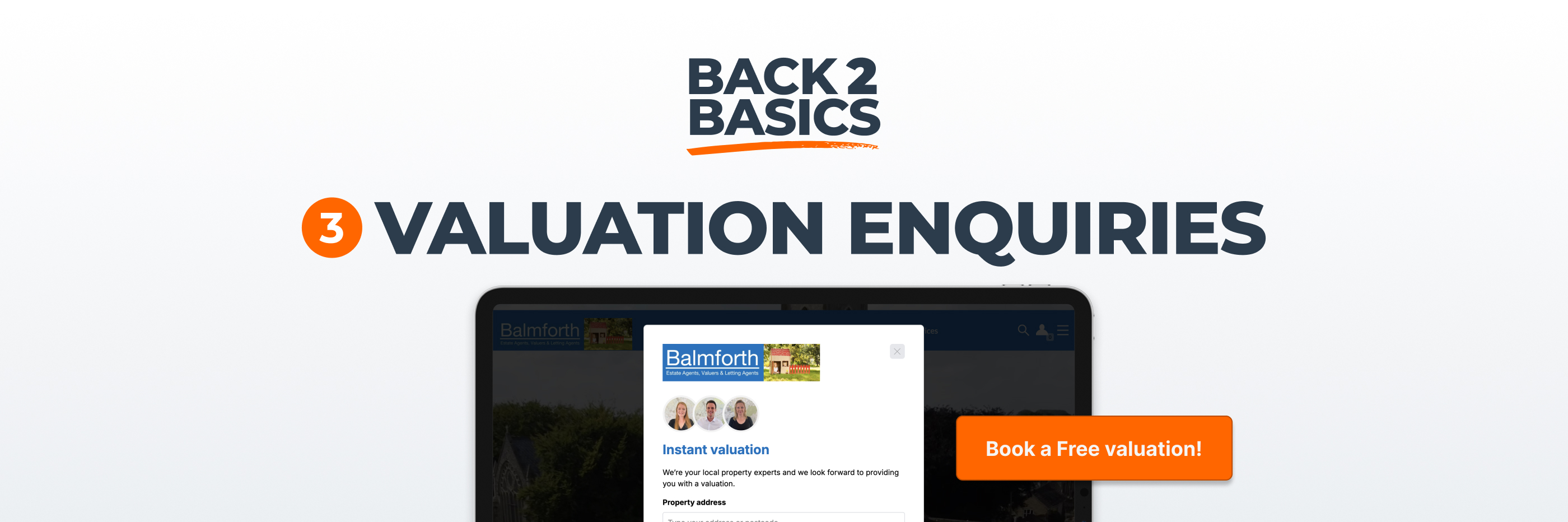
In the first two articles in this Back to basics series, we focused on trust and reassurance, because without those foundations nothing else really works. Once people feel confident in who you are and how to contact you, the next question is more commercial.
Is your website clearly designed around what actually makes you money?
Most estate agency websites attempt to do many things at once. They showcase properties, describe services, introduce the team, explain processes and support marketing campaigns. All of that has value. However, when you strip everything back and look at the business model itself, there’s one outcome that sits above the rest.
If your design, layout and messaging do not clearly prioritise that objective, you’re effectively asking your website to perform without giving it clear direction. And when direction is unclear, performance drifts.
For most sales and letting agencies, instructions drive revenue, and instructions begin with valuations. It sounds obvious when stated plainly, yet many websites position property search as the dominant feature of the homepage, as though attracting applicants were the main commercial objective.
Search matters, of course. It attracts traffic and it serves a real user need, but search supports the business while valuations sustain it.
When someone lands on your homepage, especially if they are even half considering a move, the route to requesting a valuation should feel natural and visible rather than secondary or tucked away. That usually means placing a clear valuation call to action within the first screen view on desktop, and ensuring that the same opportunity is easily accessible on mobile without requiring multiple taps or excessive scrolling.
This is not about being pushy, it’s about being intentional. If you know that valuation enquiries are your most valuable conversion, your layout should reflect that priority.
A common mistake is giving every action equal visual weight. Search, valuation, contact, about, blog, market update, all presented with similar emphasis. While that may feel balanced from a design perspective, it often leaves the visitor uncertain about what matters most.
Good information hierarchy simplifies decision making.
When a primary call to action is visually distinct and placed with confidence, users understand the intended next step without feeling forced. Secondary actions can still exist, but they should not compete for attention in the same way. The difference can be subtle, yet it influences behaviour more than most agencies realise.
If everything looks equally important, nothing stands out.
Property search still attracts significant traffic, as people are curious about the market. They want to see what’s available in their area and they may even return repeatedly to monitor pricing. That behaviour is valuable and should be supported.
However, it’s important to recognise that search serves multiple audiences, and not all of them are genuine applicants.
Many potential vendors begin their journey by browsing properties similar to their own. They filter by price and location, comparing listings against their expectations. In effect, they are acting like buyers while thinking like sellers. They’re testing whether your agency handles homes at the level they aspire to achieve.
If your search journey does not acknowledge that possibility, you’re overlooking a meaningful opportunity.
Because vendors often behave like applicants, it makes sense to gently introduce valuation messaging within the search experience itself. That could be a well placed prompt within search results pages, inviting users who are considering selling to request a valuation for a similar property.
The key is relevance. When someone is viewing a list of homes in their town at a particular price bracket, a short message that recognises their potential dual intent feels timely rather than intrusive.
It’s not really about interrupting the browsing experience, it’s about recognising the psychology behind it and responding intelligently.
By weaving valuation opportunities into high traffic areas, you allow the website to work harder without adding clutter or aggressive messaging.
There has been plenty of discussion over the years about whether the concept of above the fold still matters in a scrolling world. In practice, the first screen a user sees continues to set expectations.
If valuation messaging is buried far below the initial view, it signals that it’s of secondary importance. If it’s clearly visible, well structured and supported by confident language, it signals that you understand your own priorities.
That first impression shapes how visitors interpret everything that follows. It influences whether they explore further with intent or drift through the site casually.
The language you use around valuations also affects response rates.
Generic labels such as “Submit” or “Send” are technically accurate, but they don’t communicate outcome. Compare that with “Book a valuation”, “Request an appraisal” or “Arrange a call back”. These phrases focus on what the user receives rather than what they are doing, which subtly shifts the emotional tone of the interaction.
It’s also worth explaining briefly what happens next. If someone books a valuation, will they receive an instant estimate, a phone call, or a visit from a valuer? When expectations are clear, hesitation decreases.
Clarity builds confidence, and confidence encourages action.
A significant proportion of your traffic will arrive via mobile devices, and the smaller screen changes how hierarchy is perceived.
Something that looks balanced on desktop can feel cramped or secondary on a phone. Valuation calls to action should not be hidden behind multiple menu layers, nor should they require excessive scrolling to locate. Navigation needs to feel intuitive, and the path to requesting a valuation should be straightforward from any core page.
It’s worth testing this regularly yourself. Visit your own site from your phone, without assuming you know where everything sits. Try to book a valuation as though you were a prospective client. Notice where you pause, where you scroll back up, and where the process feels less obvious than it should.
Those moments are often where small refinements can produce meaningful improvements.
It’s easy to be influenced by trends, especially when competitors adopt new layouts or features. Yet your website should ultimately reflect your business model rather than design fashion.
For most estate agencies, consistent, high quality valuation enquiries underpin long term growth. When your homepage structure, search journey and calls to action align clearly with that commercial reality, performance tends to improve without dramatic overhauls.
Often the adjustment is not radical. It involves clarifying what already exists, strengthening hierarchy and ensuring that the most valuable actions are given the prominence they deserve.
When visitors can see exactly how to take the next step, and when that step feels purposeful and well explained, your website begins to operate as a genuine revenue engine rather than a static brochure.