Latest Update:
Startup estate agencies: understanding compliance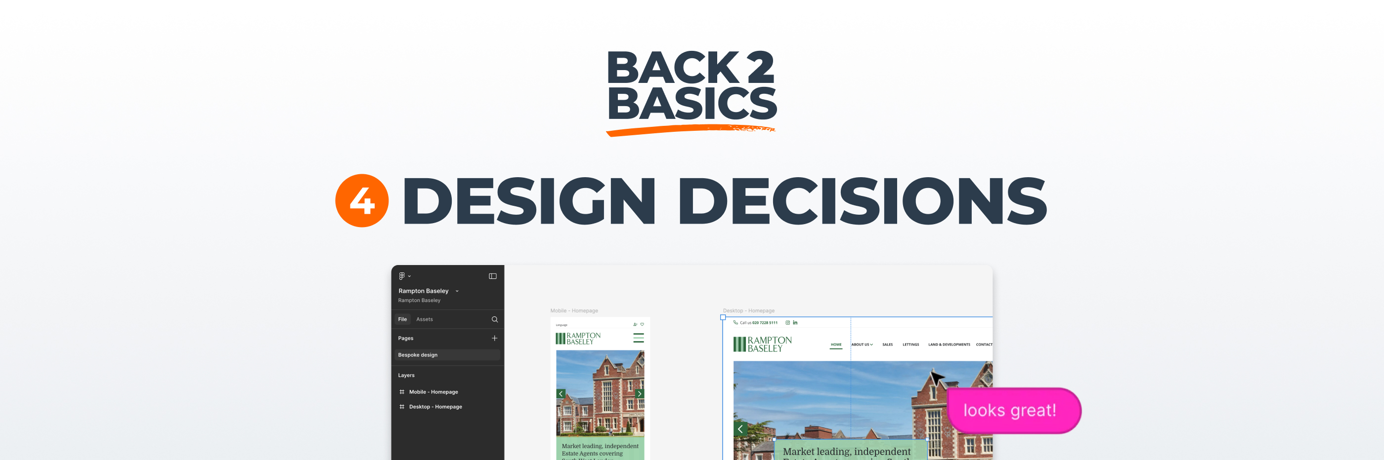
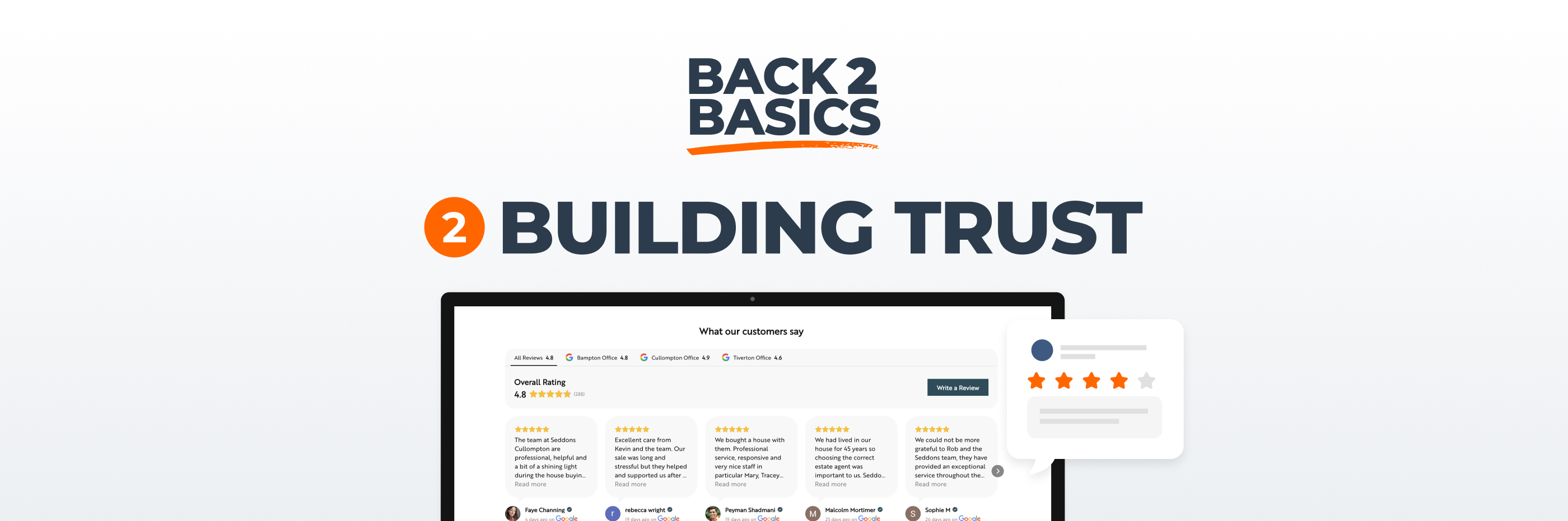
By this point in the series, we’ve covered two essential foundations. First, your website must make it easy to contact you and feel reassuringly credible. Second, it should clearly prioritise valuation enquiries, because that’s what ultimately drives revenue.
Once those strategic elements are in place, the next layer to examine is more subtle.
It’s the accumulation of small design decisions that determine whether someone hesitates or proceeds. These details rarely attract attention on their own, yet together they shape how intuitive, confident and persuasive your website feels.
You don’t usually lose enquiries because of one dramatic flaw. More often, you lose them because of small, quiet friction points that compound over time.
When a visitor lands on a page, their eyes are drawn first to elements that stand out visually. Colour contrast, spacing and size all signal importance before a single word is read.
If your primary call to action blends into the background, it sends an unintended message that the action is optional or secondary. Conversely, when it’s clearly distinct from the surrounding design, users instinctively understand where attention should go.
That doesn’t require aggressive colour choices or oversized buttons., but contrast is very helpful. If your brand palette is predominantly blue, for example, and your entire interface sits within variations of that tone, then a blue button does not command attention. It disappears into the framework.
Choosing a complementary colour for primary calls to action helps create a visual cue that feels deliberate rather than accidental. Over time, users begin to associate that colour and style with meaningful action.
Another common issue across estate agency websites is inconsistency in button styling and layout. One page uses rounded buttons, another uses square edges. One page capitalises every word, another uses sentence case. Colours shift subtly across sections. Hover states behave differently.
Individually, these variations may seem minor. Collectively, they create a sense of disorder that affects how polished the site feels.
When primary and secondary buttons are styled consistently across the entire website, users develop familiarity. They understand which actions are most important and how interactions behave. That familiarity reduces cognitive load, and when cognitive load decreases, action becomes easier.
Consistency is one of the simplest ways to strengthen perceived professionalism.
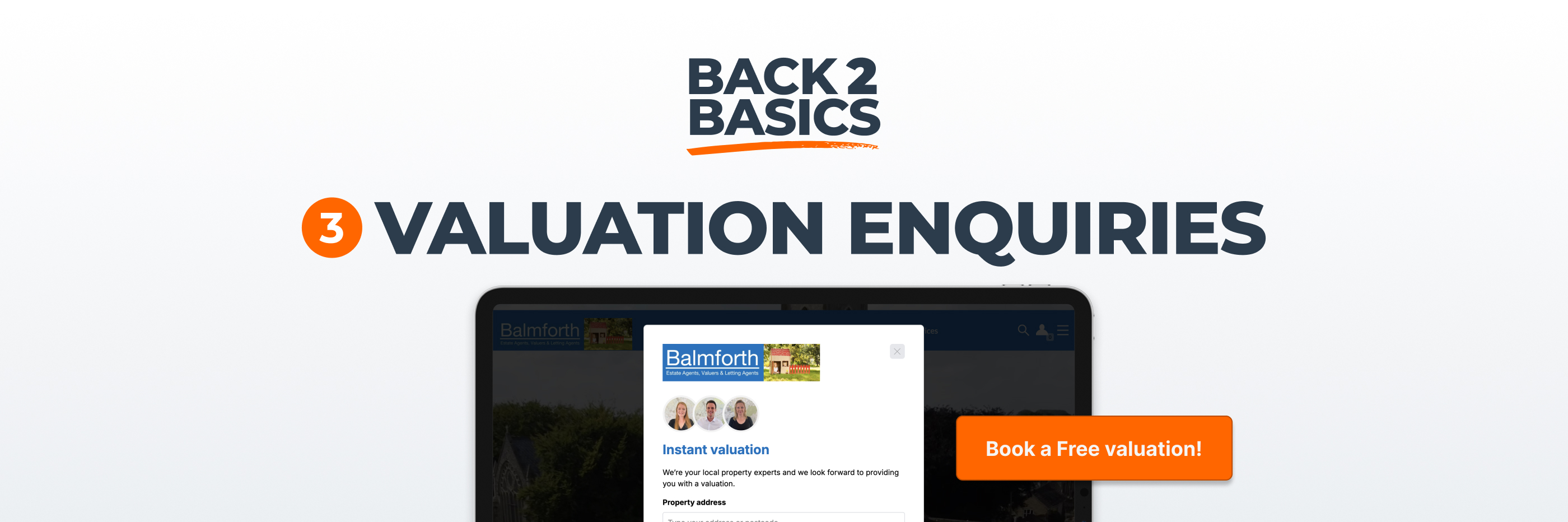
Many websites still rely on default button text such as “Submit”. It’s technically accurate, but it feels impersonal and detached from the user’s actual goal.
When someone requests a valuation, they are not submitting a form. They are booking an appointment, arranging an appraisal or asking for advice. The language should reflect that outcome rather than the technical process happening behind the scenes.
A small shift in wording can change how an action feels. “Submit” suggests process, while “Book a valuation” suggests progress. That distinction may appear subtle, yet it influences how comfortable someone feels taking the next step.
Your calls to action should describe what the user gains, not what the system does.
It’s tempting to fill every section of a page with information, especially when you want to demonstrate expertise or showcase listings. However, crowded layouts often make decision making harder.
White space, or simply the space between elements, gives content room to breathe. It separates primary actions from secondary ones and allows the eye to move naturally through the page.
When buttons are surrounded by adequate spacing, they feel intentional rather than squeezed in. When sections are clearly separated, users can process information without feeling overwhelmed.
Good spacing creates calm. Calm supports confidence. Confidence supports conversion. :-)
Interactive elements should behave in ways that confirm they are clickable. A slight colour shift on hover, a gentle underline, or a subtle change in shading when tapped on mobile provides feedback that the system is responding.
Without that feedback, especially on desktop, users can feel uncertain about whether an element is interactive. That uncertainty, even if momentary, introduces friction.
The goal is not animation for its own sake and overly dramatic effects can feel distracting or dated. Instead, focus on clarity so that when someone moves their cursor or taps a button, the response should be immediate and understated.
Navigation is another area where micro decisions accumulate.
Sticky menus were fashionable for a period, with navigation bars permanently fixed to the top of the screen. While that approach can work, it can also consume valuable screen space, particularly on smaller devices. A more refined solution is one where the menu recedes as users scroll down, then reappears when they begin to scroll back up, anticipating their need to navigate elsewhere.
On mobile, hamburger menus are now widely understood, but they should not be used unnecessarily on desktop, where full navigation is typically clearer and more efficient. The objective is always to reduce effort, not introduce extra clicks.
Ask yourself whether your navigation makes it easier for someone to find what they need, or whether it reflects design preference rather than user behaviour.
None of the elements discussed here will make or break your website in isolation. A slightly inconsistent button style or a less than ideal hover effect will not cause an immediate collapse in enquiries.
However, when several small issues combine, the overall experience feels less coherent so users hesitate slightly more often. They second guess their actions and are more likely to drift rather than commit.
Conversion is rarely about dramatic redesigns. It’s about removing layers of friction until the path forward feels natural.
If you want to assess your own micro conversion mechanics, try viewing your website with deliberate detachment. Focus not on what it says, but on how it behaves.
Are your primary calls to action visually distinct and consistent? Do buttons feel intentional and purposeful? Does the language guide users clearly towards outcomes rather than processes? Does the navigation help or hinder?
It can also be useful to compare your site with a handful of strong competitors, not to copy their design but to observe where their journeys feel smoother or clearer.
Often the improvements required are modest, yet the cumulative effect can be significant.
At a glance, design details may seem superficial compared with pricing strategy or market positioning. In practice, they communicate how carefully you approach your business.
When your website feels coherent, measured and thoughtfully constructed, it reinforces the impression that your service operates in the same way.
As we move further through this series, we’ll turn to the technical foundations that support performance behind the scenes. For now, it’s worth remembering that while strategy sets direction, detail determines execution and it can be a set of small improvements, applied consistently, that can separate an average website from one that converts reliably.
