A beautiful website means nothing if users can't figure out how to use it. Design and layout may draw people in, but it is usability that keeps them moving. More importantly, it is usability that converts them.
Unfortunately, many agency websites fall into the same traps. Some try too hard to be different, others don't try quite hard enough. Either way, the result is the same: confused users, lost leads.
We look at LOTS of agency websites, so here are some common user experience mistakes we see, and what to do instead.
Standing out is good, confusing users is not. Some agencies go too far in their quest to look modern or unique, creating layouts that feel unfamiliar or hard to navigate.
Common culprits include:
Users are not on your site to admire the artistry, they're there to get something done. Respect the conventions they already understand.
Fix it: Stick to clear, familiar layouts. Keep navigation where people expect to find it. Make buttons look like buttons. Design for clarity and ease, not novelty.
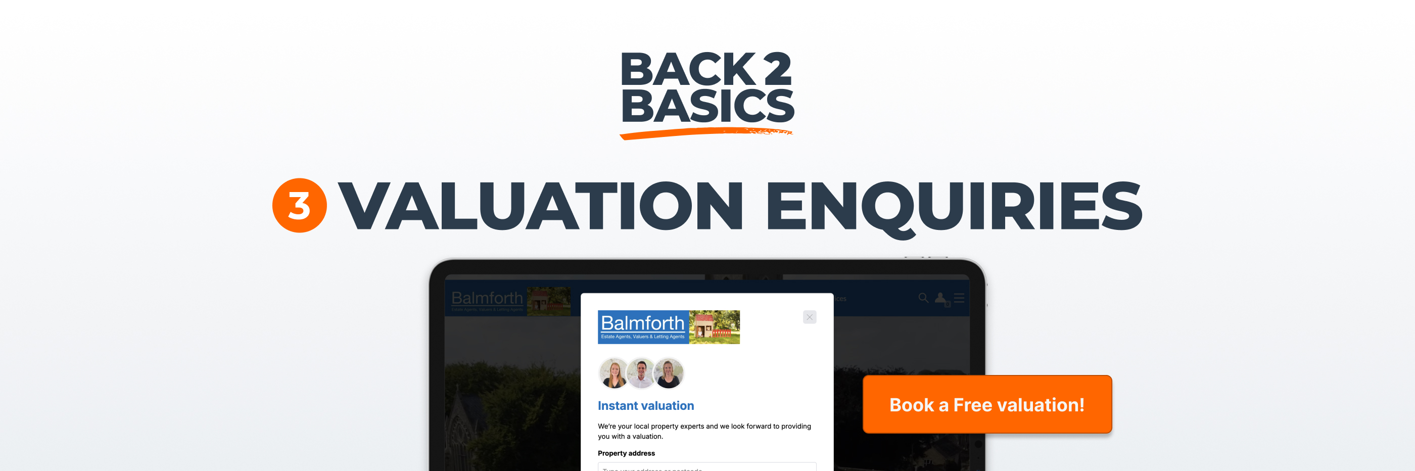
There is often more traffic from buyers and applicants than there is from sellers and landlords. But that doesn't mean your site should be focused on them.
Your most valuable visitors are the ones who may instruct you. Too many sites bury the valuation journey or make vendor content hard to find.
Fix it: Make sure valuation tools and calls to action are visible and accessible, especially on the homepage and property search pages. Treat your vendors as a priority, not an afterthought.
Asking users to engage is smart, but asking them seven times in a row is not. Some websites throw every interaction at the user at once. Popups, cookie banners, live chat windows, newsletter prompts, valuation modals... All before they've even had a chance to browse.
Fix it: Keep things simple. One or two prompts are fine, three is pushing it. Anything more starts to feel chaotic, so be polite, not pushy.
Some agency websites still rely on dated templates, poor image quality or generic stock photography. These details may seem minor, but they create a lasting impression (and the wrong one).
Would you use a pixellated leaflet or a blurry brochure? Of course you wouldn't. The same principle applies online.
Fix it: Invest in clean, modern design, using original photography where you can. Keep the site visually fresh and aligned with your brand. If it looks like you care, users will believe you do.
If your site is difficult to use on a mobile phone, you are alienating most of your audience. Mobile traffic now accounts for over 65% of visits to estate agency websites, yet some sites still treat the mobile experience as secondary.
Fix it: Design with mobile in mind from the start, and test layouts on multiple screen sizes. Use sticky buttons and streamlined menus. If a form is hard to use with one thumb, it needs rethinking.
Large background videos or full-screen hero images might look dramatic, but they often come at a cost. They slow down your site, push key content out of view, and get in the way of what the user actually came to do.
Fix it: Keep visual content purposeful and well-balanced. Use strong photography, but don't let it dominate the entire screen. Save the hero shots for listings. Use your homepage to guide and convert.
Hamburger menus are fine on mobile. On desktop, they can frustrate users, especially if they are the only way to navigate the site. Hiding everything behind an icon adds a layer of effort that some users will not bother with or may still be unfamiliar with.
Fix it: Use visible, on-page navigation for desktop views unless the design genuinely demands it. Keep your most important links exposed and accessible. The fewer clicks it takes to find what someone needs, the better.
User experience is not about being flashy; it's about being helpful. The best websites feel effortless to use because they respect the user’s time and priorities.
Get the basics right and you'll keep people on the page, earn their trust, and make it easier for them to take action.
Make it simple. Make it clear. And make it about them, not you.