Introduction
Your website serves as more than just a space on the internet—it’s the front door to your business, inviting potential clients into your world. This is particularly true for estate agencies, where first impressions can significantly impact client trust and transaction decisions. Theses common estate agent website design mistakes around user experience (UX) can turn what should be a welcoming digital entrance into a deterrent. We’ll offer practical advice for identifying these mistakes and outline strategies to not only fix them but also to enhance the overall user experience.
What is User Experience?
In the competitive property industry, where agencies pop up on every corner, a seamless user experience strategy (UX) is the cornerstone of successful online engagement.
The UX process encompasses the design, usability, and overall interaction visitors have with your agency’s website. It’s not merely about aesthetics but also about functionality and ease of navigation, crucial for converting leads into instructions.
By prioritising user-centric design and optimising every touchpoint, you can significantly enhance your website’s effectiveness in capturing leads, driving conversions, and ultimately, increasing property instructions, simply by fixing your UX website mistakes.
Why Do Estate Agents Need to Worry About a User Experience strategy?
An intuitive, easy-to-use website that delivers valuable information quickly is key to guiding visitors towards making an inquiry. Trust and simplicity can make or break a client’s decision to choose your services, exceptional UX is indispensable.
User experience strategy focuses on deeply understanding what your audience looks for, then seamlessly integrating these insights into your estate agent website to not just meet but exceed their expectations.
By enhancing UX design, you’ll see lower bounce rates, higher engagement, and more property instructions or landlord requests, paving the way for your agency’s success.
Top 3 Estate Agent Website Design Mistakes: + How to fix them
Website audits are crucial for identifying the flaws in your estate agency’s online presence.
Ensuring it functions as a powerful lead-generation tool rather than just a digital listing. By pinpointing issues such within the website design, audits help in enhancing your user experience strategy, a key factor in building trust and ease of use.
So, what are the top 3 estate agent website design mistakes we see when auditing property websites:
- Confusing Form fields
- Missing Visual Hierarchy
- Unresponsive Mobile Sites
Keep reading to see a bonus tip at the bottom that is guaranteed to increase instructions and some examples of some websites that really nail their UX.
Don’t confuse users with multiple form fields
Keep things simple and ask for the minimum information, especially in the age of data.

Most users will leave a site if they feel they’re being asked for too much information or they aren’t sure what you are asking for. By streamlining the form process you can reduce user frustration and barriers to completion. This increases the likelihood of someone filling out your lead gen form.
If this is a more in depth enquiry form where you need location information, personal information and more. You should split the form into manageable sections but keep user expectations in mind.
Don’t trick them into thinking they only need to put in their address to get a valuation or quote straight away if you’re going to gate the content behind a second personal information form or email capture.
Perfect the visual hierarchy and guide users through your site
Where you place your images and text is more important than just how it looks on the page.

Your users are guided through your website by the headings and images. A perfect example of that in this incredible picture which so clearly demonstrates how users will view your content.
Create a path for your users by placing images and text in all the right places, steering them towards your landlords form or the ‘get in touch about this property” button. You can utilise variations of your brand front or size of the text to help show users what the most important content is.
All the best sites are designed with this in mind, whether that’s a modern and fresh template or a stunning bespoke site. Designers will take your brand guidelines and use them to create an experience for users that leaves them elated and excited to sell their property with you.
Don’t Miss Mobile
Most of your users will be visiting your site from their mobile, in fact 65% of Google searches are conducted on mobile now. If you’ve not optimised your instructions lead generation page for mobile users then you’re likely missing out on a huge number of potential sellers and this estate agent website design mistake could cost you.

We always design mobile first. Crafting the website’s layout, navigation, and content strategy with mobile users in mind, before extending to larger screens.
By starting with mobile at Homeflow, we guarantee that your site is responsive, loads quickly, and provides intuitive navigation on smartphones and tablets. This not only enhances user satisfaction but also boosts SEO performance, as search engines are increasingly prioritising mobile-friendly websites.
Bonus Tip: Trust Signals
If a user is coming across your content for the first time, maybe they’ve only just started to look for an estate agent with whom to sell their house, you need to convince them quickly that you are someone to be trusted.

You can do this through case studies, testimonials and google reviews but these all take more engagement from your users, leading to another common estate agency website design mistake.
The best and fastest way to gain trust from a new user is to implement the UX design principle of trust signals.
These act as badges of honour that show your user, yes, this company can be trusted with my information and my property. They could be things like partner logos, highlighting your years of experience or badges from third party security companies.
Do you have any trust signals on your site?
Examples of websites with good UX design:
Let’s take a quick dive into the world of good UX design, exploring two websites that stand out for their user experience. Note, we’re venturing beyond the property industry to see what other sectors are doing right.
Ready for some inspiration?
Deliveroo: Delivering more than just good food
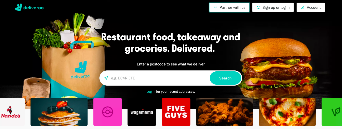
Deliveroo’s homepage nails it when it comes to UX design.
- Right off the bat, they hit you with a catchy line that sums up Deliveroo: “Restaurant food, takeaway and groceries. Delivered” Simple and straight to the point.
- The main visual? A big, tempting burger that pops against the dark background, alongside the newer service of delivered groceries. It’s so eye-catching you might just start feeling hungry and ready to order.
- They make it super easy to get started with a clear call to action: just type in your postcode to kick off your order. It’s all about getting you from “hungry” to “order placed” in no time.
- If you’re here to sign up as a delivery rider, no worries. There’s a noticeable ‘partners’ button in the header, hard to miss.
- Not ready to order just yet? No problem. You can check out menus and other foodie delights right away, without the need to scroll down or click around. Everything you need is right there, upfront.
By knowing their customers so well and thinking ahead about what they might be wondering, Deliveroo has designed a site that quickly directs users to the answers they seek, making a visit hassle-free and efficient. It’s all about understanding and meeting the needs right where customers are.
Netflix showing good movies and good UX

Netflix’s homepage is all about sleek and simple design, getting straight to the point without any clutter. Here’s what they’ve done brilliantly:
- First, they make it crystal clear that they’ve got an impressive lineup of shows and movies. How? With a background that showcases a wide variety of their latest offerings.
- The standout feature is the “Get Started” call-to-action button. It’s big, bold, and impossible to miss. Plus, there’s a neat little arrow pointing right, subtly suggesting that clicking the button is your next step into the world of Netflix. This design cleverly nudges you towards signing up, emphasising the journey you’re about to embark on with just one click.
- They also reassure you right off the bat that you can cancel anytime. These aren’t just details; they are direct messages to you, making the perks of Netflix clear and inviting.
- Coming back for more? The sign-in button is right there at the top-right corner, easy to find for returning viewers.
This design is the ultimate in clean, straightforward elegance. Why add more when you’ve said enough?
Which of these tips was most interesting to you?
Leave a comment and let us know which common estate agents website design mistake you’ll be fixing first.
If you’re not sure how your site matches up to these principles or if you want help updating things, get in touch and we’ll take care of it.
Newsletter Sign Up: Don’t Fall Behind
Our newsletter subscribers saw this content first and they’ve already been updating their websites.
Sign up to our newsletter to get all the tips and tricks you need to stand out online and increase your leads straight to your inbox.